
Halftone dots and misregistration in CSS
Print texture is not a filter. It is three measurable things: dot angle, ink offset, and opacity. Build them with gradients and masks, no images involved.
The site’s visual language is riso printing: two inks, square corners, heavy rules, hard offset shadows. The easiest thing to ruin in that language is the halftone screen — too much and it reads as a filter, too little and it is not there at all.
I broke it into three independently adjustable parameters.
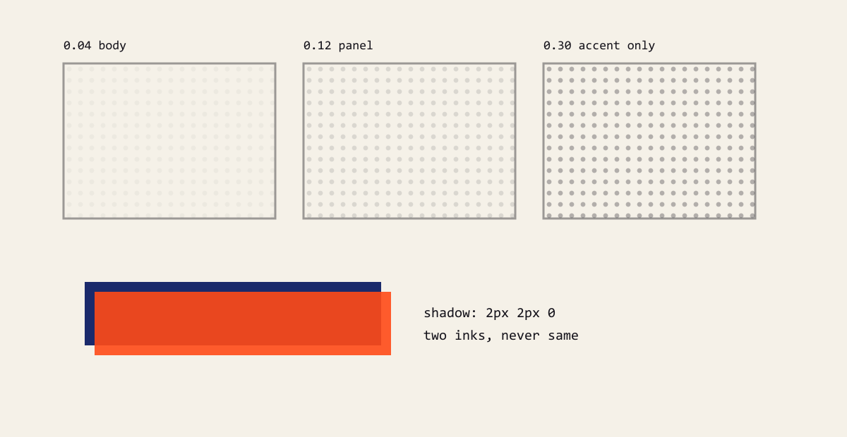
Figure: opacity decides texture versus noise; misregistration only ever uses the other ink.
A screen is angle, pitch, opacity
Real halftone dots sit on a fixed angle, commonly 45°, because diagonal grids moiré less than straight ones. In CSS:
.halftone {
  background-image: radial-gradient(
    circle at center,
    var(--ink) 0 1.2px,
    transparent 1.3px
  );
  background-size: 8px 8px;
  transform: rotate(45deg);
  transform-origin: center;
}
Draw one dot with radial-gradient, tile it with background-size, then rotate the whole element 45°. Because the element itself rotates, the corners expose empty space — put it inside an overflow: hidden container, or make the element slightly larger than its container.
Opacity decides decoration versus noise
The main risk is a screen sitting under body text. My rule: wherever there is prose, the screen never exceeds 0.06 opacity.
A single token controls it:
:root {
  --halftone-opacity: 0;
}

[data-skin='riso'] {
  --halftone-opacity: 0.06;
}
The default ink skin turns it off entirely — not every direction needs a screen. The point of the token is that components only write opacity: var(--halftone-opacity), so skins change without touching call sites.
Misregistration: offset by 2px, never blur
When a second ink lands on the first, real printing is slightly off. Two stacked text-shadow values simulate it, with one precondition: the colours must differ.
h1 {
  color: var(--ink-primary);
  text-shadow: 2px 2px 0 var(--ink-secondary);
}
With the same colour, two nearly coincident layers thicken every stroke and the line goes muddy — I hit this in dark mode. The rule afterwards: ghosts only ever use the other ink, never the same one.
Card shadows follow the same logic
Hard offset shadows with zero blur are the skeleton of this look. Use box-shadow: 4px 4px 0 var(--ink), not 0 4px 12px rgba(0,0,0,.1) — the latter instantly reads as a template.
It comes with square corners: every --radius-* is zero. Rounded corners plus hard shadows contradict each other; commit to soft or hard, not both.
Where to stop
Screens, misregistration and hard shadows together already fill the frame. My trade-offs:
- At most one screened area above the fold, and only on one side
- Never a screen under body copy
- Cards get the hard shadow only, no screen on top
The print feel comes from restraint, not from turning every effect on.
Comments
…